A good novel can be read on many levels. There is always a superficial layer, the story itself. A compelling story can be followed and enjoyed by the widest targeted audience. Beneath the surface, there are often layers of complexity and literary devices at play. Metaphor, themes and satire can be cloaked or revealed transparently. We all learn about this in grade school, and some go further in university really dissecting books for everything the author intended (or maybe didn’t) to present the reader. Here is a slightly, more data-driven way to dig into a book. I loaded the entire content of both On Swift Wings and Gulliver’s Travels into a data analytics workflow to compare and contrast the styles and contents. A few tools used here include sentiment flow, word correlation, word complexity and vocabulary. There are some fascinating details that can be revealed. I hope you’ll enjoy this data analysis of these two novels.
By the way, the script I wrote takes about 5 seconds to run once I have the manuscript, whether from Project Gutenberg or a text/word file. If you’d like to see the same analysis about your book, or a favourite public domain book, just let me know.
Comparing Sentiment Flow

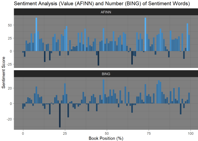
I think these two graphs are particularly interesting. The top two bar charts are an analysis of sentiment value in On Swift Wings (my book) and the bottom two are for Gulliver’s Travels. You’ll note that I’ve blocked out the end of On Swift Wings. I don’t wish to spoil any surprises about whether the ending is happy or sad.
For background, the BING model determines a raw count of whether a word should be deemed “Positive” or “Negative.” Simply put, if the bar is above the line, then the corresponding 1% of the book has more positive words than negative ones. The AFINN model scores different words according to whether they are very positive, somewhat positive, somewhat negative, or very negative and assigns a value that way. In this way, the AFINN model measures the use of emotions with strength. Words like “Torture” and “Ecstasy” bear a greater weight than “Good” or “Bad.”
The first interesting finding is that in general I use quite a few more negative words than Jonathan Swift. The overall balance in terms of raw scores flows from positive at the beginning of the novel to more negative in the later stages. Swift tends to be more positive throughout, in fact, using more positive words particularly near the end of Gulliver’s Travels. (Note, I’m still not talking about the actual end of On Swift Wings.)
While I tend to use more negative words than positive, by weight (AFINN) On Swift Wings has a similar weighted score to Gulliver’s Travels. Most parts of the book are positive, and to a similar degree to Gulliver’s Travels. I think this is particularly interesting. Evidently, I use stronger, more impactful words to counterbalance a general negativity.
Sentiment Word Maps


To the point about the strength of words used, these word clouds illustrate for each book how commonly different words are used that carry sentiment (size of font) and how impactful that sentiment is (lighter colour = less impact). Both books show many similar words (Great, Like, Good, No, Dead), but there are differences. There are a greater quantity and distribution sentimental words used more frequently in On Swift Wings. Both images were generated using the same code, the difference in shape is due to a difference in style. I invite you to look at the words and compare them yourself. I could look at these two figures for hours.
Again, if you’d like to see your favourite public domain novel, let me know, I’ll run the script and send the results. (I’ll probably put the code on GitHub soon too)
Word Correlation Map


These two figures demonstrate word combinations. Words that are used frequently together are connected. The more often, the thicker and brighter the line. Again, many differences can be seen between the two works. I tend to use a few words together frequently while Mr. Swift has a few clusters of interconnected words, and few other patterns he repeats.
Word Summary Statistics
| Measure | On Swift Wings | Gulliver’s Travels | Comparison |
|---|---|---|---|
| Word Count | 121,426 | 104,280 | 116% |
| Unique Words | 11,848 | 8,359 | 142% |
| Unique Word Ratio | 9.75 | 8.02 | 122% |
| Average Word Length | 6.39 | 6.21 | 103% |
Here’s a really quick little analysis counting the number of words, how many of them are unique, what the ratio of unique to total words is and average word length. It isn’t a valid measure of quality, but On Swift Wings is 16% longer than Gulliver’s Travels, there are 42% more unique words in On Swift Wings, and each word is on average 4% longer. Reading On Swift Wings, you’ll encounter a new word approximately 22% more frequently than reading Gulliver’s Travels.
Before the hate rains down, please remember that this is all good fun. Gulliver’s Travels is a great book, and I strongly recommend it. I only hope that On Swift Wings will be intriguing and entertaining as well.
Weekly Review Section
Thank You Stewart Adams
I received my first review on Amazon this week! As hoped, the book is a challenging but rewarding read. Please keep the reviews coming! Amazon.ca or Amazon.com, Goodreads, Indigo. Reviews are desperately needed to spread the word and get the book in front of more readers. Please.
An interesting modernization of Gulliver’s Travels. There are some great concepts in the book including “perfect” societies and how one person can make a difference.
Worth your time. Stewart Adams – Amazon Review
It is not an easy read due to the meaty sentences, but I am glad I read it.